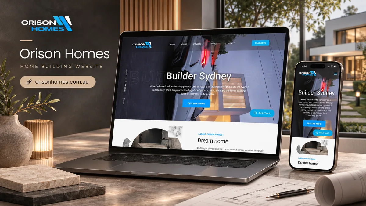
Orison Homes: presenting residential building through a clear digital experience
A home-building website needs to connect visual ambition with practical information. Prospective clients want to see the quality and character of a builder’s work, but they also need to understand the services, people and process behind the photographs. My Orison Homes project brings those priorities together in a property-focused business presentation.
Orison Homes presents residential building and development services in the Sydney market. Its public website includes residential construction, granny flats, specialist disability accommodation design and build, pool construction and childcare developments. With such varied project types, the website needs to introduce the overall business while giving visitors a clear route toward the service relevant to them.
Business context and project goals
The company emphasizes communication, flexibility and the individual needs of its clients. These ideas are especially relevant to building projects, where a visitor may be exploring possibilities long before they have finalized plans. The website has to accommodate both inspiration and more specific project discussions.
My focus was a structured presentation in which photography, service information and enquiry options support one another. A visitor should be able to understand what the business offers, explore examples and identify how to start a conversation. This creates a more useful experience than a gallery with little explanation or a service page with no visual context.
Organizing a varied construction offering
The site separates company information, services, projects, gallery and contact into recognizable navigation areas. That distinction helps visitors approach the business from different starting points. Someone interested in a granny flat can look for service information, while someone assessing the builder’s style can begin with completed-project imagery.
The homepage provides an overview of those destinations rather than asking every visitor to read the entire site in one sequence. Service summaries establish the breadth of the offering, and project links add a more concrete view of the work. Company and team sections provide additional context for a high-consideration business decision.
Photography and visual hierarchy
Architecture and interior imagery carry much of the visual communication. Large photographs help introduce materials, spaces and the character of residential projects. The surrounding design needs enough restraint to let those images remain the focus, with typography and action elements providing direction rather than competing with them.
I approached the presentation as a balance between visual interest and readable structure. Project names and service headings should remain easy to locate, while supporting copy explains the relevance of each section. Consistent spacing helps the page move from aspiration to detail without feeling like a collection of unrelated promotional panels.
Project browsing and gallery functionality
The public website includes project entries such as Chipping Norton, Orison Greystanes and residential properties identified by their locations. Individual project destinations give the portfolio a more substantial structure than a single strip of images. The gallery offers a complementary visual route for visitors who want to browse the work more broadly.
These two formats serve related but different purposes. Project entries provide a named point of reference, while a gallery emphasizes the visual range. Keeping both understandable helps prospective clients explore according to their interests, whether they are considering a particular type of build or collecting ideas for an initial discussion.
Enquiry design around real project information
The contact experience asks what the visitor is looking to build and what stage of planning they have reached. Options include houses, duplexes, granny flats, SDA and townhouses, with planning stages ranging from looking for land to approval milestones. These questions make the enquiry more relevant to the building process.
The form also provides contact and address fields, giving the business a structured starting point for a follow-up conversation. My UX perspective is that an enquiry route should reflect the service being discussed. Here, project type and planning stage are more useful context than a generic invitation to send any message.
Development approach and business presentation
My development discussion centers on the relationship between media, content and navigation. Image-led layouts need sensible content widths, readable text and clear destinations. As sections adapt to different screen sizes, the order should still make sense: introduce the service, show relevant work and offer the next step. These principles inform my frontend development approach.
Orison Homes is a portfolio example of presenting a substantial residential service offering through clear information and visual context. For another construction-sector website, explore Evergreen Remodeling & Roofing. My work here reflects a practical goal: help prospective clients understand the business well enough to begin a meaningful project conversation.