Money & Investing: connecting a podcast with its digital audience
A podcast website needs to do more than display a show title. It should introduce the people behind the content, explain what listeners can expect and make it easy to continue on a preferred listening platform. My Money & Investing project centers on that connection between a recognizable media brand and an organized publishing experience.
The website presents Money and Investing with Andrew Baxter, an Australian podcast covering money and investment education. Its content combines a show introduction, video previews, articles, books and educational offerings. The challenge is to give those different formats a coherent home while keeping the main podcast journey visible.
The publication and its audience
Visitors may arrive because they recognize Andrew Baxter, have encountered an individual article or want to explore the podcast for the first time. Those entry points require different kinds of orientation. A new listener needs a concise introduction; a returning reader needs access to recent material; someone who already follows the show may simply want a platform link.
The site’s Australian context also gives the content a specific identity. Its articles and episode-related material address investing topics through an educational publishing model. My case study focuses on how that material is presented and discovered, with the website supporting the relationship between the audience and the publication.
Project goals and content priorities
I approached the experience around a clear content hierarchy: identify the show, introduce the presenter, offer a direct listening route and make supporting resources discoverable. A media homepage can easily become crowded when every episode, article and promotion has equal visual weight. Giving each type of content an identifiable place helps the page communicate its purpose.
The podcast subscription invitation appears early, while additional sections provide presenter context, preview material and links to educational resources. The blog extends the experience for visitors who prefer reading or arrive through a specific topic. Together, these routes support both initial discovery and an ongoing relationship with the audience.
Podcast access and visible website features
The public site links to Apple Podcasts and Spotify, with YouTube and Facebook routes for video content. Those familiar destinations reduce the effort involved in continuing from the website to a listening or viewing environment. The homepage also contains video-preview controls, allowing the show’s format and personality to be introduced visually.
A name-and-email subscription area offers another way to follow new releases. The blog listing presents recent articles with titles, summaries and links to the full content. Books, company information and contact navigation provide supporting destinations without replacing the podcast as the central focus.
Design for a recognizable media brand
The presentation uses a strong red, black and white identity, paired with presenter photography and prominent headings. This gives the site a clear connection to the show’s branding. The contrast also helps separate major content areas and makes subscription actions easy to recognize within a long homepage.
My design perspective was to balance that bold identity with readable content. Long introductions need manageable paragraphs, article previews need consistent treatment and platform links should be immediately understandable. These details matter because the page serves several media formats while still needing to feel like one publication.
Development and publishing considerations
For a content-led website, the underlying development approach should accommodate an expanding archive. New material needs a predictable presentation, and links from a homepage preview should lead clearly into the full article or external media destination. Consistent heading levels and reusable content patterns help that archive remain navigable as it grows.
I view the homepage as an introduction and distribution point rather than a place to reproduce every available resource. Platform buttons, preview sections and article cards each serve a specific role. Keeping those roles clear makes the page easier to understand and supports a more maintainable publishing structure. This aligns with the content organization I bring to my frontend development services.
Search relevance and content discovery
Specific article titles give readers context before they open a page, while the surrounding publication identity helps connect individual topics to the wider podcast. This is an important relationship for a site that can receive visitors through many separate pieces of content. The reader should understand both the topic they found and where to explore next.
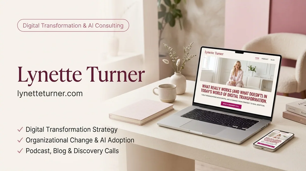
Money & Investing demonstrates my work on a publishing and podcast presentation with several connected audience journeys. For another personal-brand project combining expertise and media, see Lynette Turner. The emphasis here is a coherent digital home where show introductions, listening options and written resources work together to support continued discovery.