Lynette Turner: a personal-brand website connecting expertise, content, and discovery calls
My work on Lynette Turner’s website focused on a personal-brand presentation with clear routes into content and professional services. The website introduces Lynette’s work around digital transformation, organizational change, and AI adoption, while providing blog and podcast destinations for people exploring her perspective.
I approached the experience around the relationship between a recognizable individual voice and useful information. Visitors need to understand who the professional is, what kind of work she offers, and where they can learn more or begin a conversation. The design and content structure support those different stages of interest.
Business overview and audience
The current public offering focuses on the people side of digital and business change. Lynette describes support involving readiness, leadership alignment, stakeholder engagement, communication, and adoption. The website introduces assessments, speaking, workshops, and advisory conversations as ways to engage with that expertise.
The audience includes organizational leaders, HR teams, and people involved in transformation initiatives. They may be looking for practical support or simply investigating a subject through an article or podcast. The website needs to make room for both an ongoing content relationship and a more immediate service enquiry.
This combination gives the site a broader role than a professional biography. It becomes a place to introduce the person, explain the offering, and connect an audience with current thinking.
Project goals and visitor pathways
My focus was on intuitive content discovery and a consistent personal-brand presentation. The primary navigation keeps Home, Podcast, and Blog easy to recognize. This compact structure gives the visitor clear choices without allowing a long menu to compete with the opening message.
The homepage introduces Lynette’s perspective and places a discovery-call action beside it. Supporting sections then explain ways to work together, including readiness assessments, speaking, and workshops. The reader can move from a broad proposition into more specific engagement options.
Repeated call-booking links support different levels of readiness. Someone arriving with a defined need can act early, while another visitor can explore the service explanations and articles before deciding to make contact.
Service explanation and content organization
The service presentation separates assessment work, speaking, and workshops into recognizable areas. Each has a different purpose: understanding readiness, introducing ideas to an audience, or helping teams work through a subject. Clear distinctions help visitors identify which kind of conversation may be relevant.
The assessment explanation also introduces a sequence from understanding the current situation to findings and possible follow-up workshops. This provides context around the service instead of relying only on a label. Visitors can understand the shape of the engagement before opening the booking destination.
Articles on change leadership and digital adoption add another layer of information. Their links make the author’s work discoverable from the homepage and give readers a route into longer material. The podcast destination similarly supports an audience that prefers to explore through listening.
Design and user experience
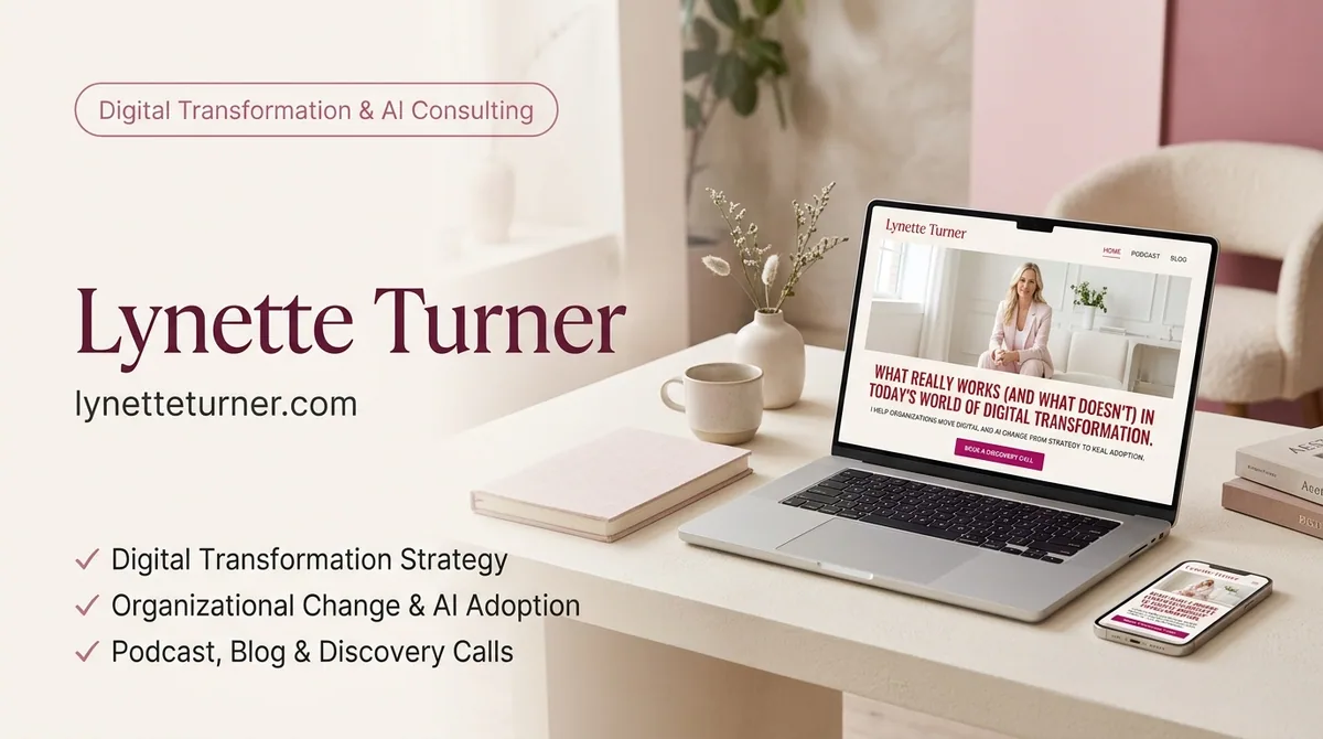
The desktop opening pairs a large portrait with a prominent editorial headline. A light background, red serif typography, and a stronger pink booking action establish a personal visual identity. The composition makes the professional herself central to the introduction while keeping the service proposition readable alongside the photograph.
The header uses spaced navigation labels, creating a quieter frame around the more expressive hero. This gives the page a recognizable brand presence without making the basic navigation difficult to find.
My UX priorities were a clear relationship between identity, expertise, and action. A personal-brand website should communicate an individual point of view, but visitors still need practical answers about services and next steps. The page structure gives those answers room to develop below the initial impression.
Contact and ongoing audience connections
Discovery-call links lead to a scheduling destination, providing a direct way to begin a professional discussion. The site also includes email and social connections, giving visitors alternatives for staying in touch or exploring the wider public presence.
These options serve different needs. A booking route is useful for a specific business conversation, while content and social destinations allow a less immediate relationship with the author’s work. Keeping both available supports the personal-brand model without treating every visit as an instant sales enquiry.
My development approach
I approached the website as a connected editorial and service experience. The homepage introduces the professional, service sections explain relevance, and content destinations provide depth. Consistent headings and recognizable actions help visitors move between those layers.
As a content library grows, clear entry points matter. Blog and podcast destinations should remain understandable to new visitors, while homepage links can highlight selected material. The development structure needs to support that relationship between ongoing publishing and the stable business introduction.
My work brings those considerations together in a personal website where visual identity and useful navigation share the same purpose: helping the right audience understand the work and decide how to continue.
Explore my frontend development services for personal-brand and publishing websites. The Elizabeth April case study provides another example of connecting a creator’s identity with a broader content offering.
Conclusion
Lynette Turner’s website connects professional expertise, an individual visual identity, content discovery, and a clear route to a conversation. My work focuses on making those different journeys coherent and approachable. Visit the Lynette Turner website to explore its current services and content.