City Dermatology Clinic: organizing a private clinic’s online information
City Dermatology Clinic’s website introduces a London dermatology business through service information, clinician profiles, practical location details, and appointment enquiries. The public experience has to help readers identify the relevant information without turning a complex range of services into an overwhelming list. My work focused on readable structure, clear navigation, and a professional healthcare presentation.
I approached the website around the questions prospective patients bring to a clinic: which services are available, who provides them, where the clinic is located, and how to make contact. Connecting those questions with clear information gives the website a practical purpose throughout the visitor journey.
Business overview and audience
The homepage identifies City Dermatology Clinic as a private dermatology provider in London. Its public navigation includes doctors, reviews, company information, removals, treatments, pricing, and contact. The offering presented on the site spans general dermatology, skin-related procedures, and selected aesthetic services.
The site also publishes information about its Queen Street and Harley Street locations. Address details, nearby station information, opening hours, and contact routes are relevant to people considering an appointment. These practical details sit alongside the service explanations, recognizing that choosing a clinic involves both understanding the offering and planning how to contact or visit it.
Project goals and content structure
My goal was to provide understandable service information and straightforward appointment enquiries. The homepage supports that purpose with a service introduction followed by grouped links to individual topics. A separate doctors destination allows visitors to explore the team, while pricing has a visible place in the main navigation.
This structure gives different questions their own route. A reader looking for a named service can follow a specific link, someone researching the practice can explore the clinic and doctor information, and someone ready to enquire can use a contact option. The value of the hierarchy is its separation of tasks rather than an assumption that every visitor reads the homepage from beginning to end.
Website functionality and enquiry options
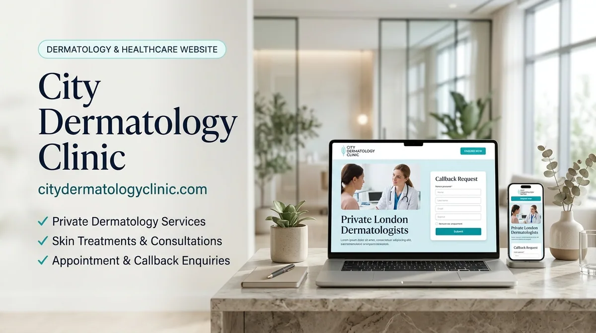
A callback-request form appears prominently in the opening section of the desktop homepage. Its visible fields ask for a name, email address, and telephone number, with a submit control below. The location of that form makes enquiry possible without first moving through the entire service directory.
Further enquiry actions appear lower on the page, and the footer repeats contact information and the callback route. Location sections provide map links and local travel context. These details connect the online enquiry journey with the practical information needed to plan a visit.
The site also displays review content and links to external review sources. Their role in the interface is to give visitors another area to investigate. Keeping that supporting material alongside dedicated doctor and clinic information gives readers several ways to explore the practice.
Design and user experience
The desktop layout uses light blue and white surfaces, dark blue accents, and healthcare photography. The hero places the clinic introduction on the left and the callback form on the right. A white form panel separates the input fields from the background photograph, making the contact opportunity visually distinct.
Service links are grouped beneath descriptive headings, giving the broad offering a more manageable structure. The page combines these service areas with doctor and clinic context, while practical information remains available in the footer. I used that hierarchy to keep service information readable and make important destinations easy to discover.
The visual hierarchy gives each kind of content a clear role. The opening introduces the clinic and enquiry option, the service groups support topic discovery, and the location sections help visitors plan their next step. My approach keeps those different needs connected within one professional presentation.
My development approach
My development approach centers on clear paths through a substantial body of healthcare information. A service directory needs recognizable categories, supporting pages need consistent navigation, and contact options should appear where visitors can use them naturally. These relationships are central to making the website useful.
I treated content structure and interface presentation as connected decisions. Long lists of services become easier to navigate when grouped under meaningful headings, while clinician and location information benefits from dedicated destinations. The callback form gives the page an immediate next step without requiring every visitor to follow the same reading sequence.
The project also illustrates the importance of practical details in a service website. Opening hours, addresses, travel information, telephone contact, and enquiry routes help translate online interest into a clear action. My work brings these details into the wider experience rather than leaving them as disconnected footer content.
For a healthcare organization planning a website, my WordPress development services provide a starting point for discussing content structure, service pages, and enquiry requirements. The wider project portfolio includes further service-business examples with different audiences and workflows.
Conclusion
City Dermatology Clinic illustrates the information demands of a private clinic website: explain the service range, make clinician and location details discoverable, and offer a clear route to contact. Its public desktop experience brings those elements together through grouped content and visible callback options. Explore the clinic’s website for current information. My work connects the clinic’s service presentation with the information and enquiry routes visitors need.