AZ Tutoring: helping families understand online learning support
AZ Tutoring, presented publicly as AZS Tutoring, is an education-services website that introduces online tutoring and guides families toward an enquiry. Its central communication task is practical: explain who the service supports, distinguish the learning options, and help a parent or guardian share the right information with the team.
My work focused on making educational services easy for families to understand and giving them a simple route to request support. I organized the experience around two tutoring options, clear grade ranges, detailed service information, frequently asked questions, and a structured enquiry form.
Business overview and audience
The website describes AZS Tutoring as a focused service by AZ Simple Solution and identifies Tucson, Arizona, in its footer. Its published offering separates general online tutoring for K1–K5 from mathematics tutoring for K1–K12. Those distinctions are important because families need to know whether a service applies to the student’s grade and learning requirements before they make contact.
The general tutoring option introduces one-to-one support, homework and study guidance, explanations of core subjects, and practice. The mathematics offering emphasizes concept support, guided problem-solving, and learning at the student’s pace. The website gives each option enough detail for families to identify the support that fits their learner.
Project goals and information structure
My starting point was to provide clear descriptions of subjects, formats, and communication options. The homepage addresses those questions near the start: online delivery is explicit, both service types are named, and the grade ranges appear before the visitor reaches the contact section. Starting-rate information is also presented as part of the service explanation.
The main navigation combines page sections with dedicated destinations. Services, benefits, process, FAQs, and contact can be reached within the homepage, while Online Tutoring and Math Tutoring have separate detail pages. This gives visitors a quick overview without preventing them from investigating a specific learning option in greater depth.
Functionality and the enquiry journey
Two opening actions offer a choice between requesting guidance and exploring tutoring options. The service cards then provide descriptions, grade information, feature lists, and links to further detail. This sequence helps a family move from a general learning concern toward the relevant support category.
A three-step process section explains what happens next: choose a service, share the student’s goals, and receive guidance. The FAQ area addresses common questions about grades, rates, online sessions, and requesting support. Those explanations provide useful context before the form rather than leaving parents to infer the process from field labels.
The request form asks for a parent or guardian name, email address, optional telephone number, tutoring service, student grade, and learning goals. The service and grade fields use selectable options, giving the enquiry more structure than an unrestricted message alone. This helps families provide useful context in their first message, including the type of support and the learner’s current stage.
Design and user experience
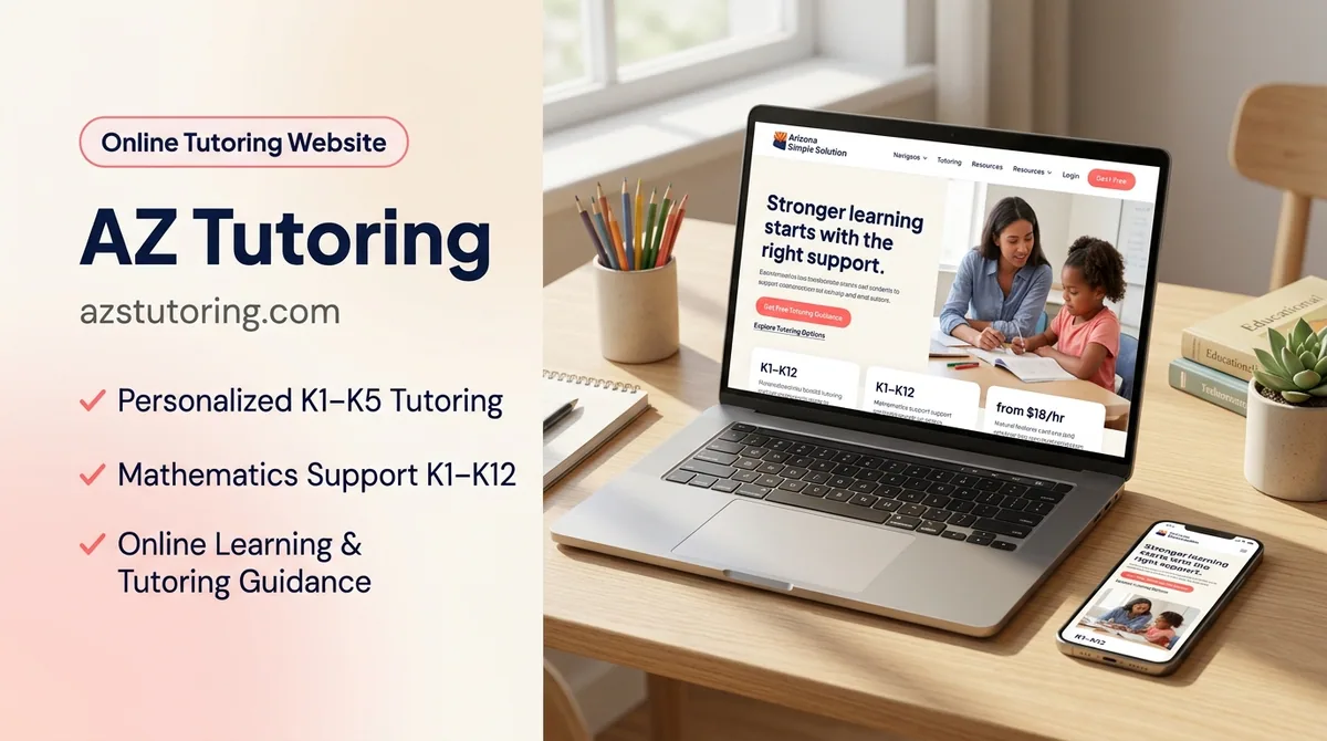
The desktop homepage uses dark blue headings, red action buttons, a light background, and soft pink accents. The opening text occupies the left column while a tutoring photograph sits on the right. Rounded corners and a small supporting information panel give the image area a clear relationship with the surrounding content.
A row of summary cards highlights grade coverage, the number of service options, online delivery, and starting-rate information. These short facts complement the longer explanations farther down the page. The visual hierarchy lets a reader identify the basic offer before deciding how much detail to read.
Repeated guidance links connect the opening, benefits, FAQ, and contact areas. This supports my objective of a simple contact pathway, while the service-detail pages accommodate readers who need more context. The result is a page that offers both a quick overview and a more detailed route for parents who want to explore before making contact.
My development approach
I approached the development around the questions a family brings to an education website: who is the service for, what does it cover, how is it delivered, and what happens after an enquiry? Connecting the page structure to those questions gives the design a practical purpose beyond its visual presentation.
My work connects the homepage overview with focused service destinations and a request form that reflects the offering. The service selection and grade fields keep the enquiry aligned with the learning options presented above. The process and FAQ sections then help explain the next step before a parent reaches the form.
Consistency across these elements is important. The same service distinctions should remain recognizable in the navigation, cards, detailed pages, and enquiry choices. That continuity helps families move through the site with a clear understanding of what they are asking for.
For organizations planning an educational service website, my WordPress development services provide a relevant starting point for discussing service pages and enquiries. The AZ Simple Solution application case study offers related business context while remaining a separate portfolio entry.
Conclusion
AZ Tutoring demonstrates a focused approach to presenting online educational support: distinguish the services, explain eligibility, answer practical questions, and collect a structured enquiry. My work brings these elements together in an approachable education website built around clear information and a practical next step. Visit the AZS Tutoring website for current learning options and service information.