Arc Lighting: navigating an automotive LED product catalogue
Arc Lighting’s website presents automotive LED bulbs, lamps, and accessories to visitors who need both product information and a route toward the right application. Unlike a simple brand brochure, the public experience has to accommodate technical product names, different vehicle requirements, and dealer-related questions. My work focused on organizing that product information into a clear automotive shopping experience.
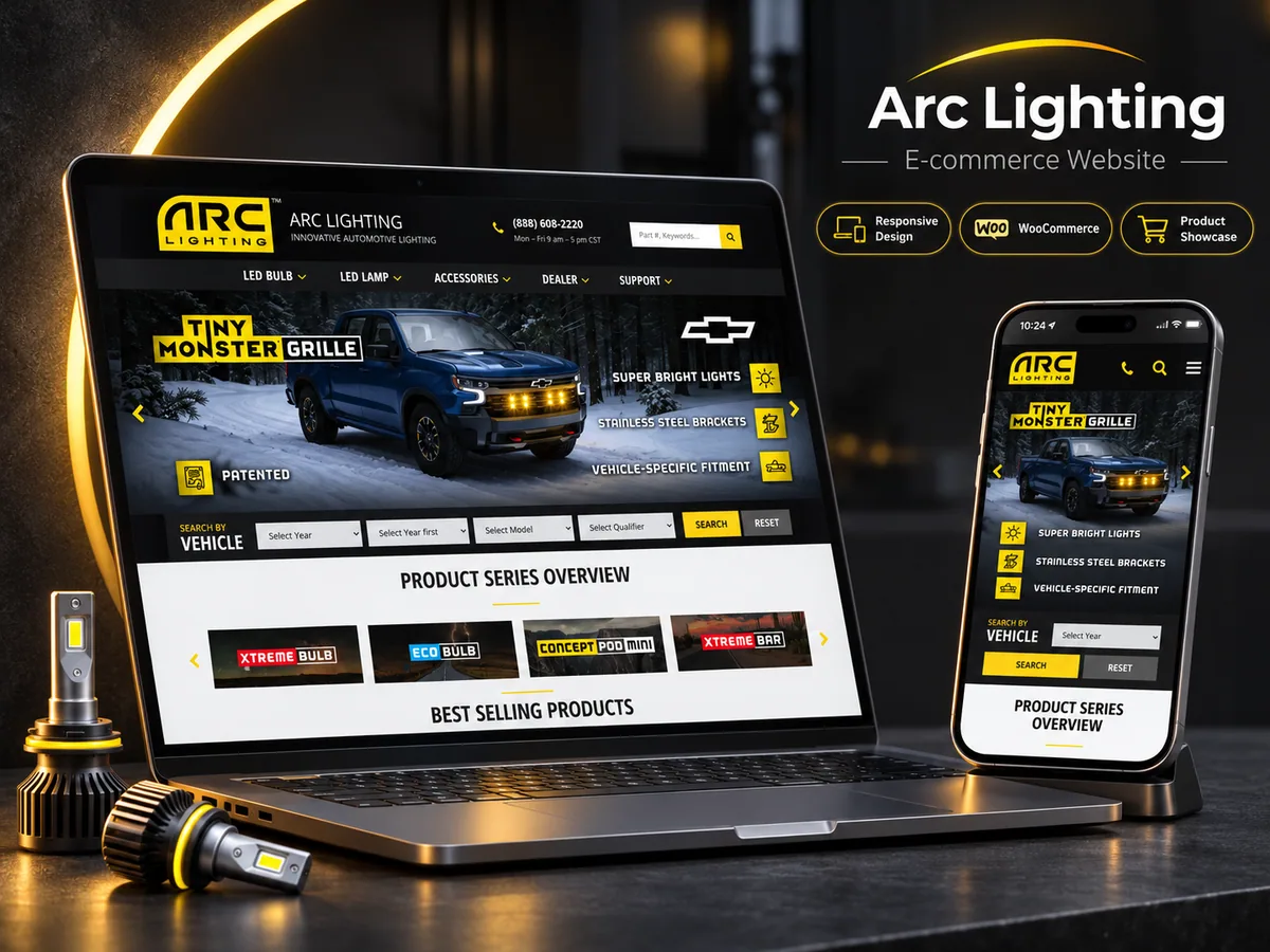
The published homepage brings those requirements together through product categories, named lighting series, a vehicle-search interface, and customer-support destinations. I approached the website around those connected needs, keeping product discovery, vehicle context, and support information easy to distinguish.
Business overview and product context
The brand identifies its offering as automotive lighting. Its navigation separates LED bulbs, LED lamps, and accessories, and the homepage introduces product families including Eco, Concept, Xtreme, Concept Pod Mini, Xtreme Bar, and Tiny Monster Grille. Those named ranges give customers more than one way to recognize and explore the offering.
The catalogue also uses detailed product identifiers. Visible examples include bulb kits labeled with fitment codes and individual part numbers, as well as grille kits associated with particular vehicle models. This is a product environment where imagery alone cannot explain the differences. Names, application context, and structured browsing all contribute to the visitor’s ability to locate useful information.
Project goals and catalogue organization
My goal was to help visitors distinguish product types, understand intended applications, and identify an appropriate next step. The homepage addresses those tasks through several entry points. Primary categories serve people who know the kind of lighting they want, product-series links serve visitors familiar with a range, and keyword or part-number search offers a more direct route for specific queries.
A separate vehicle-search area appears immediately below the main promotional imagery. Its visible controls follow a year, make, model, and qualifier sequence, with Search and Reset actions. Initially disabled follow-on fields communicate that earlier selections come first. The ordered controls make the selection process understandable by showing which choice comes next.
Features for customers and dealers
Below the vehicle-search area, the homepage presents a product-series overview and product cards linking to individual catalogue entries. Some cards identify specific bulb codes, colors, quantities, or vehicle-specific kits. These details support a different browsing task from the broad promotional banner: readers can move from recognition of a product family toward a more precise item.
Dealer-related destinations include an application page, a locator, and a partner portal link. The website also exposes support, returns, warranty, contact, and vehicle-testing destinations. This separates product discovery from the practical questions that may arise before or after a purchase. The partner portal destination gives trade visitors a separate route alongside the customer-facing catalogue.
Telephone contact information and business hours are visible in the header and footer. These provide another route for people who need assistance beyond the catalogue. The website’s public navigation therefore serves both independent browsing and a more assisted product-selection journey.
Design and user experience
The desktop interface uses black and dark gray framing with strong yellow accents. The brand logo, search action, carousel controls, and several promotional elements share that accent color. Large automotive imagery establishes the product context, while the vehicle-search bar sits close to the opening promotion rather than being hidden in a secondary page.
The following catalogue area switches to a light background, allowing product-family graphics and headings to stand apart from the dark header. Horizontal groups create distinct browsing areas for series and products. This visual hierarchy supports a progression from brand and application imagery to catalogue navigation and individual item detail.
I kept the relationship between imagery and technical detail central to the experience. Product photography establishes the lighting range, while part numbers, family names, and application information provide the precision customers need as they narrow their choices.
My development approach
My development approach centered on the catalogue as a connected information system. Category navigation, product-series links, item cards, and support destinations each answer a different customer question. Keeping them consistent helps visitors move between broad browsing and a specific product without losing the context of the wider range.
Automotive product information also needs careful presentation of identifiers. A short visual label can introduce a family, but detailed names and application references need enough room to remain readable. My work balances those needs through distinct sections and a hierarchy that separates promotional content from product selection.
The dealer and support routes extend that structure beyond the catalogue. Customers and trade visitors have different next steps, so the interface gives both a recognizable place. This keeps the website useful across product exploration, business enquiries, and ongoing assistance.
For a comparable product-led project, my e-commerce development services provide a starting point for discussing catalogue structure and business requirements. The wider project portfolio includes other retail examples for comparison with this automotive use case.
Conclusion
Arc Lighting illustrates the information demands of an automotive product website: category distinctions, detailed item labels, vehicle context, dealer routes, and accessible support information. Its current public interface brings those needs into a connected catalogue experience. Explore the Arc Lighting website for current product details. My work brings the brand presentation and detailed catalogue into a coherent visitor journey.